
A benchmark comparison of image-first vs. text-first prompting in vision language models.
Last week I was trying to squeeze every last drop of performance out of my company’s workhorse OCR model, the usual grind of prompt engineering and hyperparameter tweaking, when I stumbled onto a GitHub issue on the Qwen-3-VL repo that made me do a double-take.
Someone claimed their task accuracy jumped just by swapping whether images came before or after the prompt text. Not fine-tuning. Not changing the prompt wording. Just… moving the image.
That sounded ridiculous. Transformers use positional encoding, sure, but the model sees the same pixels and the same words either way. Order shouldn’t matter that much.
So I tested it. And I was wrong.

Simply reordering your inputs, putting the image before the text instead of the text before the image, delivers a 13–18% improvement. No model changes. No extra compute. Just a different sequence.
Here’s what I measured across 89 OCR samples:
Both results are statistically significant at p < 0.01. Same model, same data, different ordering, and suddenly you’re giving up double-digit gains if you follow the “normal” convention.
Let me walk you through how I got here, because the why turns out to be just as interesting as the what.
Before we go further, let’s make sure we’re on the same page about what’s actually being swapped here.
When you call a vision-language model through an OpenAI-compatible API, you send a messages array. Inside each message, you can include both text and images, but you decide the order of those content blocks.


It’s the same information. The model receives the exact same pixels and the exact same words. The only thing that changes is the sequence, meaning which tokens reach the transformer first.
I assumed it would amount to a rounding error. It didn’t.
I needed a dataset that would truly stress-test this, not just confirm that models can read clean text. That’s where OCRBench v2 comes in. It’s a fantastic torture test covering everything from pristine documents to total nightmares like ASCII art, CAPTCHAs, and messy handwriting.
Here’s a taste of what these models are up against:
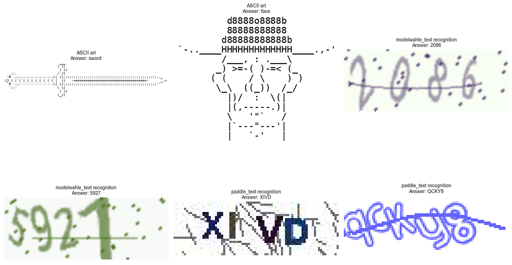
If a model is going to hallucinate or break down, it’s going to happen on samples like these. That makes this a perfect playground for testing whether small tweaks, like input order, actually move the needle.
A quick note on scale: I’m a bit GPU-poor, so I limited this to 100 samples (89 after filtering out failures). I used weighted sampling to keep the subset representative of the benchmark’s full difficulty curve, without cherry-picking easy wins. The goal wasn’t to chase a leaderboard score. It was to isolate whether prompt structure matters. If you’ve got a beefier cluster and want to replicate this on the full dataset, I’d genuinely love to see those results.
I tested two small, production-friendly VLM families:
Why these two? First, they’re small enough to run with decent throughput on my M3 MacBook Pro (32GB RAM) using llama.cpp, so no cloud bills, no GPU cluster, just local inference. Second, and more importantly, they come from different model families. If the ordering effect only showed up in one architecture, it could be a quirk. If it shows up in both, it points to something more fundamental.
Everything ran in Q8_0 quantization with ChatML formatting. I didn’t do any custom image preprocessing, so no manual resizing, cropping, or normalization. Images went straight to llama-server, relying on whatever default handling llama.cpp does internally. The point was to test what a typical developer would actually experience, not a carefully optimized pipeline.
For generation settings, I used the Qwen team’s recommended decoding parameters with one change: temperature = 0.0 to force deterministic outputs. When you're trying to measure whether order matters, you don't want sampling randomness muddying the waters.
temperature: float = 0.0,
top_p: float = 0.8,
top_k: int = 20,
repetition_penalty: float = 1.0,
presence_penalty: float = 1.5
(Quick aside: with temperature at zero, you’re basically doing greedy decoding, which makes `top_p` and `top_k` mostly irrelevant. I kept them fixed anyway for parity between runs so that’s one less variable to worry about.)
Before I throw numbers at you, let’s talk about what those numbers actually mean.
The primary metric here is ANLS — Average Normalized Levenshtein Similarity. It’s the standard scoring approach for OCR benchmarks, and it answers a simple question: how close is the model’s prediction to a valid answer?
The formula looks like this:
ANLS(p,a) = 1 − (edit_distance(p,a) / max(∣p∣,∣a∣))
In plain English: if the model’s output exactly matches the ground truth, ANLS = 1.0. If it’s completely wrong, ANLS approaches 0. If it’s almost right, like “Invoice Total: $1,234” versus “Invoice Total: $1,235,” you get partial credit based on the number of character edits needed to correct it.
A few implementation details that matter:
I also report a simple accuracy metric by thresholding: if ANLS ≥ 0.5, I count it as correct. It’s somewhat arbitrary, but it provides a quick “did it basically get this right?” statistic alongside the softer, partial-credit ANLS.
This is also why ANLS and accuracy can move differently in the results. ANLS rewards near-misses, while thresholded accuracy can flip based on small changes around that 0.5 boundary.
For each of the 89 samples, I created two identical inputs with one difference: order.
Each version ran through both models with the same decoding settings. I logged the raw predictions plus metadata (sample ID, task type, ordering) to a JSON file, then computed ANLS and accuracy from there.
Simple A/B test. Swap the order, keep everything else fixed, score the outputs.
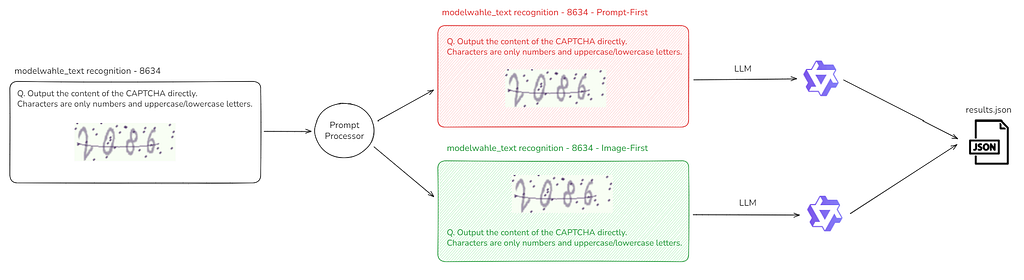
Side note on scale + fairness: In theory this is 400 total calls (100 samples × 2 models × 2 orderings). In practice, 11 samples failed at least once (either a bad client request or a timeout). To keep this comparison clean (and to save time) I restricted analysis to the 89 samples that successfully completed across both orderings and both models.
Each model still sees the exact same content, just in a different sequence. If order truly doesn’t matter, performance should be similar across the two configurations. If it does, the data will make it obvious. Let’s look at what actually happened.
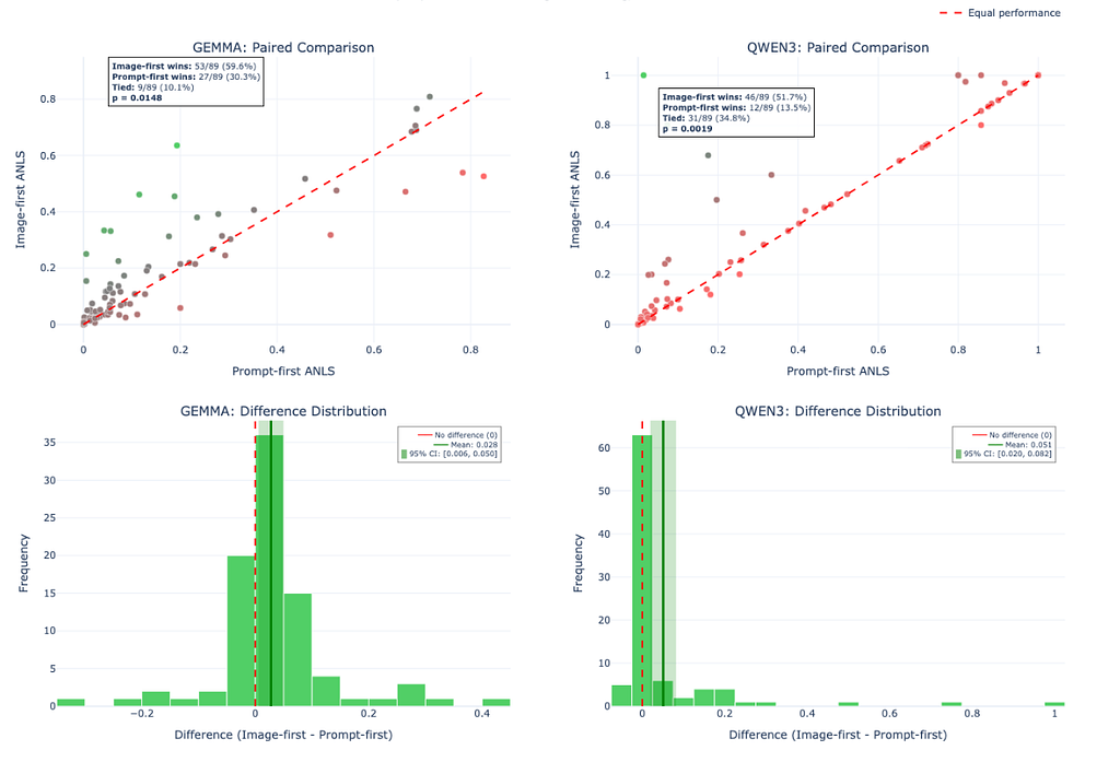
Here’s what the head-to-head looks like across all 89 samples.
If ordering didn’t matter, you’d expect the scores to be roughly equal, with points scattered symmetrically around a diagonal line and differences centered tightly around zero. That’s not what happened.
Across both model families, Image-First wins more often, and the per-sample differences skew positive. This isn’t a couple of lucky outliers dragging up the average. The effect shows up repeatedly across many examples.
For those rusty on statistics: a p-value tells you “if there were truly no ordering effect, how likely is it that random chance would produce differences at least this large?” For Qwen, p = 0.0019 means this outcome would be extremely unlikely if order didn’t matter. Gemma’s p = 0.0148 is less extreme but still well under the conventional 0.05 threshold. Neither of these is noise.
The takeaway is simple: input order measurably changes performance, and image-first tends to help.
The ordering effect isn’t uniform. Some OCR task types swing hard when you put the image first. Others barely budge.

I broke this down by task category using a simple sensitivity score: (Image-First ANLS − Prompt-First ANLS). Positive means image-first helped; negative means prompt-first was better.
The biggest gains show up in tasks where the model has to understand structure and spatial relationships before it can answer:
This makes intuitive sense. Diagram QA samples often require grounding text and symbols in a dense visual layout. Letting the model “look” first seems to help it anchor the scene before committing to an interpretation. Formula recognition and ASCII art are visually fragile problems where small shape and layout details matter more than broad linguistic context.
For standard OCR workloads like text recognition, key information extraction, and document parsing, the effect is still positive, but smaller. We’re talking about a +0.039 to +0.041 ANLS lift. It’s a steady nudge rather than a dramatic jump.
And then there’s the exception: full-page OCR actually got worse with image-first (−0.052 ANLS). My hypothesis is that long-form transcription behaves more like a “reading mode” task, where stating the instruction first helps the model set expectations before it processes a dense page of text. But I’m calling it a hypothesis for a reason. This category has a small sample count, so treat it as directionally interesting rather than definitive.
The practical takeaway: if you’re working with forms, invoices, tables, charts, or diagram-heavy extraction, Image-First looks like the safer default. If you’re doing full-page transcription, test both orders, because Prompt-First might actually help.
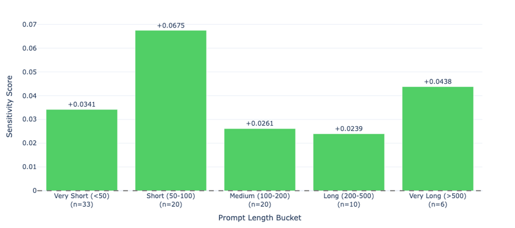
Here’s a pattern I didn’t expect: the shorter your prompt, the more ordering matters.
When I bucketed samples by prompt length, the largest sensitivity showed up in the 50–100 character range, with an average +0.068 ANLS lift for image-first ordering. The breakdown:
One plausible explanation: longer prompts give the model more linguistic scaffolding to “recover” even if the ordering is suboptimal. With a short prompt like “Extract the total” or “What is this?”, there isn’t much context to preserve. If the prompt comes first, the model has to carry a tiny instruction through a large block of image tokens, and that instruction can get diluted. If the image comes first, the model forms a visual representation and then immediately applies the simple query to what it already “sees.”
The annoying implication: that fast, minimal, one-liner prompting style you’ve probably adopted for production? Those are the prompts most affected by ordering. Longer, carefully engineered prompts still benefit from image-first, but the effect is muted because the model has more room to re-anchor itself mid-stream.

Most of the time, prompt ordering only nudges the score, maybe a few percentage points either way. But every so often, it’s the difference between a model that “can’t do this” and a model that nails it.
When I grouped the 89 paired runs into outcome buckets, the pattern was clear:
That last bucket is the interesting one. The model clearly has the capability, it just accesses it reliably when you present inputs in the right sequence.
A few concrete examples:
And there are rare reversals too. Sample 5842 (Full-page OCR) is one where prompt-first won decisively: 0.827 vs. 0.526. That matches the earlier hint that long-form page transcription can behave differently.
The point isn’t that every sample flips. Most don’t. The point is that the flips that do happen are exactly the ones that matter in real systems: invoices, forms, key-value extraction, and document parsing.
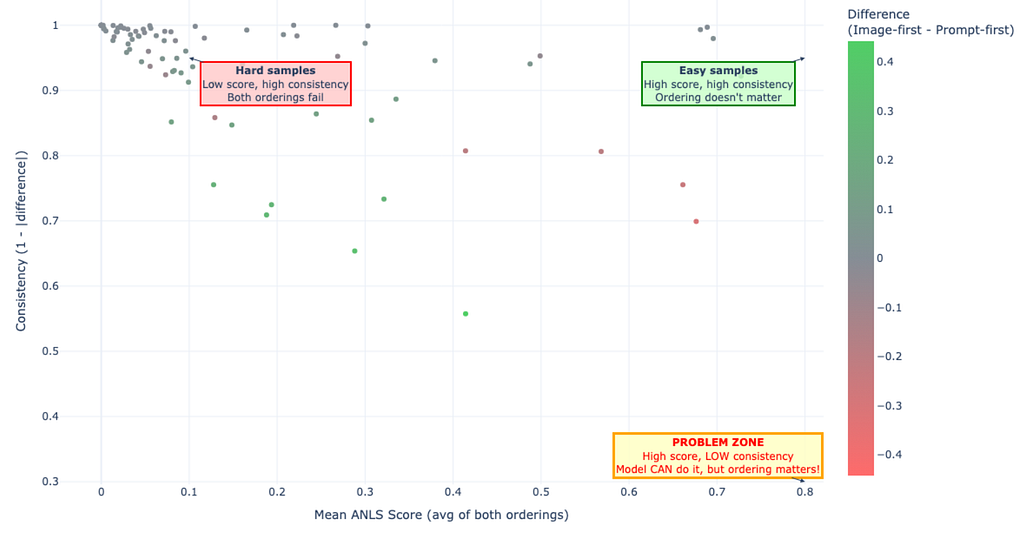
So far we’ve been looking at averages and task categories, but the ordering effect also varies at the individual sample level. Some samples are rock-solid regardless of how you arrange the input. Others are weirdly fragile.
The good news is that most samples are stable. 73 out of 89 (82%) fall into the high-consistency bucket (>0.9), where the model behaves similarly regardless of ordering. Either it succeeds both times or it fails both times in roughly the same way. Another 13 samples (15%) land in medium consistency (0.7–0.9), where the two orderings differ somewhat, with one getting partially right while the other drifts into a different near-miss.
Only 3 samples (3%) show low consistency (<0.7), meaning the two orderings lead to dramatically different predictions. These are the samples that make prompt ordering feel almost mystical, where a trivial formatting change moves you from a strong answer to a weak one, or vice versa.
Here’s where it gets interesting. There’s a “problem zone” worth paying attention to: high mean score but low consistency. These are cases where the model can perform well (the average score across both orderings is solid), but whether it actually performs well depends on which sequence you happened to use. In my test set, only one sample sits clearly in that region, but it illustrates the production risk perfectly.
That risk is silent underperformance. Your model might be capable of “80% quality” on a workflow, but if you’re using the weaker ordering, you might only observe “50% quality” and conclude the model just isn’t good enough. You’d be wrong. The capability is there; you’re just not consistently accessing it. The interface is bottlenecking you, not the model itself.
This is why I keep emphasizing A/B testing on your own task mix. The aggregate stats say image-first is generally better, but the sample-level consistency analysis says the effect on your documents and prompts could range from negligible to make-or-break. You won’t know which until you test.
I can’t prove the mechanism without digging into model internals, like attention maps, KV-cache dynamics, or training data distributions, so what follows is informed speculation. But the pattern is strong enough that it’s worth offering a few theories. They’re not mutually exclusive.
Theory 1: Positional attention bias (a primacy effect)
Transformers encode position, but that doesn’t mean all positions are treated equally in practice. Earlier tokens may get a slightly better “seat at the table,” especially while the model is forming its initial context. If that’s true, putting the image first places visual tokens in the most privileged positions. Putting text first forces the image to compete with a context that’s already been established.
This would also explain why short prompts show higher sensitivity. With fewer text tokens up front, the image lands earlier and faces less competition. There’s related discussion of primacy-like effects in multimodal prompting in papers like “Order Matters” (arXiv:2410.16983), even though the exact mechanism may vary by model family.
Theory 2: Training distribution match
Models perform best on input formats that resemble what they saw during training. A lot of vision-language training data is implicitly Image-First: image to caption, image to description, image to Q/A. If the training distribution heavily favors Image-First, then Image-First isn’t a clever trick. It’s simply the model’s native dialect.
Prompt-First becomes a mildly out-of-distribution formatting choice, and performance drops in subtle but consistent ways.
Theory 3: A grounding + “working memory” constraint
The most intuitive explanation is that seeing the image first lets the model build a visual representation before it has to answer a query.
With Image-First, the model can form a grounded internal state from the pixels and then apply the instruction on top of it. With Prompt-First, the model reads an instruction and then has to carry that intent through hundreds of image tokens, and the instruction can get diluted along the way.
This lines up with what I observed: the biggest gains were on visually demanding, structure-heavy tasks where the model needs deep visual grounding before it can reason.
Here’s what this means for your API calls:
# ❌ What most tutorials show you (suboptimal)
messages = [
    {"role": "user", "content": [
        {"type": "text", "text": "Extract the invoice total"},
        {"type": "image", "image": invoice_img}
    ]}
]

# ✅ What actually works better (+13-18% accuracy)
messages = [
    {"role": "user", "content": [
        {"type": "image", "image": invoice_img},
        {"type": "text", "text": "Extract the invoice total"}
    ]}
]
That’s it. Swap two lines. Test on your own evaluation set. Ship whichever ordering wins.
Don’t treat this as a universal law. The overall trend favored image-first, but there are real task-level exceptions (full-page OCR being the clearest). The safest production approach is to A/B test ordering on your own data with the same prompts, same images, same decoding settings.
A few caveats before you go rewriting all your production code:
Reproducibility note: My initial pass used the model’s default sampling (temperature > 0), which means identical inputs can yield slightly different outputs. To confirm this wasn’t just sampling noise, I reran with temperature = 0.0 and the ordering effect still showed up. The figures in this post reflect the original sampling run since that’s closer to how most teams actually deploy these models. Deterministic outputs are in the GitHub repo if you want strict repeatability.
Scope: This is deliberately narrow. I tested two open-source models because they run well locally and have llama.cpp support but that’s just two points in a huge design space. I didn’t test proprietary models (GPT-4V, Gemini, Claude), and it’s entirely possible commercial models behave differently due to different training, architectures, or explicit tuning for order invariance.
Task coverage: Everything here is based on OCRBench v2, which is heavily document/OCR-centric. I didn’t evaluate general VQA, captioning, multimodal reasoning, multi-image inputs, or interleaved text-image-text-image formats. This is strong evidence of an ordering effect for OCR-style workloads, not proof that all VLM prompting is order-sensitive in the same way.
Sample size: 89 samples is enough to show statistical significance, but it’s not exhaustive, especially once you slice by task type or prompt length. The obvious next step is replication at 500+ samples on a task-specific dataset.
Input ordering measurably affects VLM performance. In my runs, flipping the sequence changed scores by 13–18%, and the effect was statistically significant (p < 0.01). For OCR and document-understanding workloads, image-first was generally the better default across both model families I tested.
The best part? It’s a zero-cost optimization. No fine-tuning, no extra compute, no architectural changes. Just swap the order, A/B test it on your task, and ship whichever wins.
Sometimes the simplest fixes are the ones hiding in plain sight.
All code and data available on [GitHub]
If this was useful, feel free to share. And if you replicate this with different models, datasets, or task types, let me know what you find, I’d love to feature follow-up results from other setups.
If you have any questions, I will be happy to answer them. Feel free to message me on my LinkedIn or my email for other queries.
<hr><p>Why Your VLM Prompts Are Backwards (And How to Fix It) was originally published in GoPenAI on Medium, where people are continuing the conversation by highlighting and responding to this story.</p>